
One of the best ways to attract and engage customers is with a solid, understandable logo. Logos are the shorthand version of a company’s message to customers—a simple way to share the company’s values and make an impression. The big question is, how do you know when you’ve got it right… and when it’s time for an update? To explore this, we decided to track how logo evolution relates to revenue for some of the most iconic brands in the world.
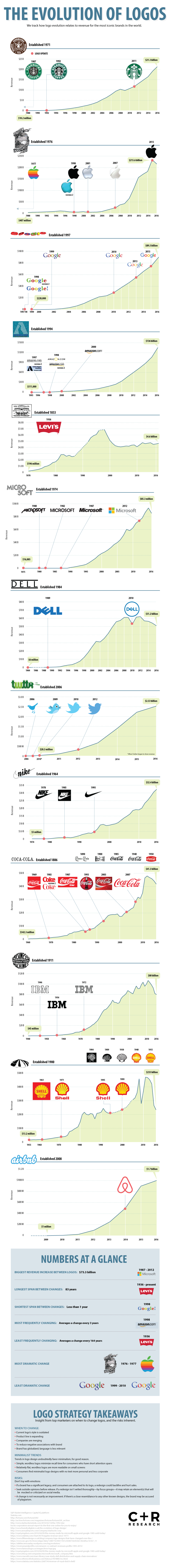
If a company expects to have staying power, they must learn to adapt to public expectations. As tastes change, so must a company’s branding, to avoid negative perceptions. Most brands will go through a few iterations before settling on the logo we know and recognize, including big brands such as Google, Nike, and Starbucks. Amazon tinkered with several iterations before 2000, when the online shopping behemoth really took off. Shell Gas, on the other hand, has spent the past 117 years refining and tweaking the same shell graphic, making mild adjustments to avoid looking outdated but keeping the general theme and coloring. Legacy companies like Shell, Coca-Cola, and Levi Strauss know that if consumers are attached to a logo, a redesign could backfire and hurt sales.
The perception of being outdated is like a death sentence in the technology industry. Billion-dollar tech companies, such as IBM, Dell, Google, and Apple, understand that clean, simple logos with no text feel more personal and less corporate to consumers. Also, relatively flat designs are more readable on small screens. Additionally, simple, wordless logos have more appeal to a global audience, as there are no language or translation barriers to contend with.
In 2006, Twitter’s original logo was a green, slime-drenched nonsense word with missing vowels, and rather obviously, no staying power. Within the year, the blue bird silhouette replaced the green ooze and went through a few modifications (including adding vowels to the company name), as the social platform began its enormous rise. Today, with the company worth $2.53 billion, the simple blue bird is one of the most easily recognized logos around the world.
And then there are the very few (and lucky) companies, whose logos have transcended past simple marketing and into the very fabric of American identity. Levi Strauss and Coca-Cola, who have been around since the mid- to late 1800s, know not to mess with perfection. Where Levi has only changed their logo once in its 164-year tenure, Coca-Cola has tinkered and fine-tuned the iconic script font several times but always remains recognizable and relatable to consumers.
A new logo has the potential to breathe new life into a faltering brand, or miss the mark completely and risk losing customer trust in the process. Companies who take the time to thoughtfully consider and design a logo could lead to a billion-dollar pay off.
explore featured
Case studies